Timing-associated genes analysis with TimeFateKernel
In our single-cell analysis, we analyse the underlying temporal state in the cell, which we call pseudotime. and identifying the genes associated with pseudotime becomes the key to unravelling models of gene dynamic regulation. In traditional analysis, we would use correlation coefficients, or gene dynamics model fitting. The correlation coefficient approach will have a preference for genes at the beginning and end of the time series, and the gene dynamics model requires RNA velocity information. Unbiased identification of chronosequence-related genes, as well as the need for no additional dependency information, has become a challenge in current chronosequence analyses.
Here, we developed TimeFateKernel, which first removes potential noise from the data through metacells, and then constructs an adaptive ridge regression model to find the minimum set of genes needed to satisfy the timing fit.CellFateGenie has similar accuracy to gene dynamics models while eliminating preferences for the start and end of the time series.
Colab_Reproducibility:https://colab.research.google.com/drive/1Q1Sk5lGCBGBWS5Bs2kncAq9ZbjaDzSR4?usp=sharing
import omicverse as ov
import scvelo as scv
import matplotlib.pyplot as plt
ov.ov_plot_set()
   ____            _     _    __
  / __ \____ ___  (_)___| |  / /__  _____________
 / / / / __ `__ \/ / ___/ | / / _ \/ ___/ ___/ _ \
/ /_/ / / / / / / / /__ | |/ /  __/ /  (__  )  __/
\____/_/ /_/ /_/_/\___/ |___/\___/_/  /____/\___/

Version: 1.6.9, Tutorials: https://omicverse.readthedocs.io/
Dependency error: (pydeseq2 0.4.11 (/mnt/home/zehuazeng/software/rsc/lib/python3.10/site-packages), Requirement.parse('pydeseq2<=0.4.0,>=0.3'))
Data preprocessed
We using dataset of dentategyrus in scvelo to demonstrate the timing-associated genes analysis. Firstly, We use ov.pp.qc and ov.pp.preprocess to preprocess the dataset.
Then we use ov.pp.scale and ov.pp.pca to analysis the principal component of the data
import cellrank as cr
ad_url = "https://fh-pi-setty-m-eco-public.s3.amazonaws.com/mellon-tutorial/preprocessed_t-cell-depleted-bm-rna.h5ad"
adata = ov.read("data/preprocessed_t-cell-depleted-bm-rna.h5ad", backup_url=ad_url)
adata
We need to check if the data has been normalized and logarithmized, we find that the maximum value is 13, then the data has been logarithmized.
adata.X.max()
12.226059
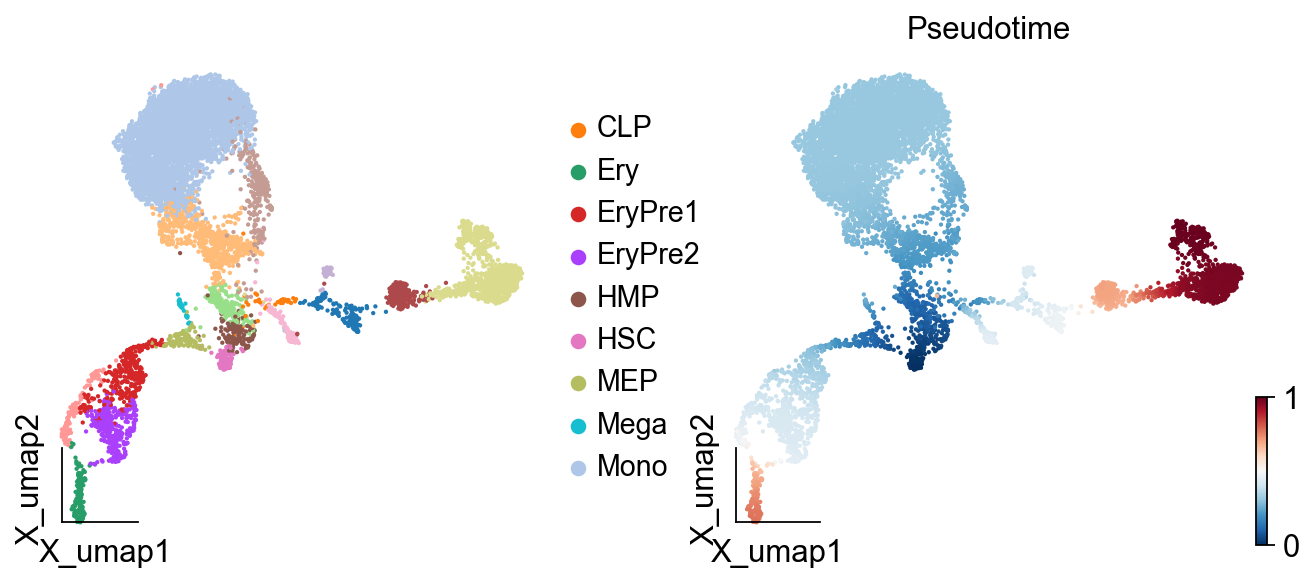
ov.pl.embedding(adata,
                basis="X_umap",
                color=['celltype','palantir_pseudotime'],
                title=['','Pseudotime'],
                size=15,
                show=False, #legend_loc=None, add_outline=False,
                frameon='small',legend_fontoutline=2,#ax=ax
)
[<AxesSubplot: xlabel='X_umap1', ylabel='X_umap2'>,
 <AxesSubplot: title={'center': 'Pseudotime'}, xlabel='X_umap1', ylabel='X_umap2'>]
Initialize the timing model
In TimeFateKernel, we only need to specify the pseudotime parameter to automatically fit genes that contribute to pseudotime.
cfg_obj=ov.single.Fate(adata,pseudotime='palantir_pseudotime')
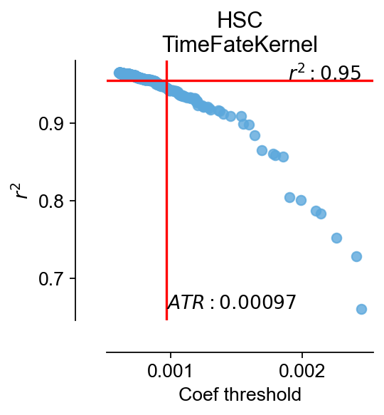
cfg_obj.model_init()
cfg_obj.ATR(stop=500)
$MSE|RMSE|MAE|R^2$:0.0024|0.049|0.037|0.95
coef_threshold:0.0009673292515799403, r2:0.9458897232697306
| coef_threshold | r2 | |
|---|---|---|
| 0 | 0.002444 | 0.661107 |
| 1 | 0.002407 | 0.728704 |
| 2 | 0.002259 | 0.752481 |
| 3 | 0.002137 | 0.783143 |
| 4 | 0.002099 | 0.786696 |
| ... | ... | ... |
| 495 | 0.000610 | 0.964707 |
| 496 | 0.000610 | 0.964685 |
| 497 | 0.000610 | 0.964671 |
| 498 | 0.000609 | 0.964718 |
| 499 | 0.000608 | 0.964769 |
500 rows × 2 columns
#If the function `plot_filtering` reports an error, specify the threshold manually.
#cfg_obj.coef_threshold=0.001
fig,ax=cfg_obj.plot_filtering(color='#5ca8dc')
ax.set_title('HSC\nTimeFateKernel')
Text(0.5, 1.0, 'HSC\nTimeFateKernel')
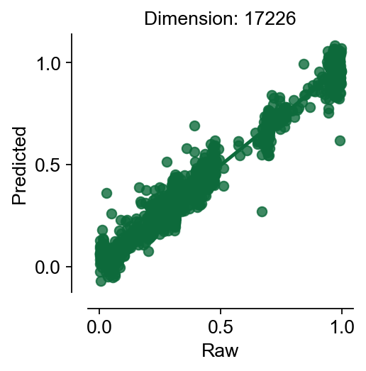
res=cfg_obj.model_fit()
$MSE|RMSE|MAE|R^2$:0.003|0.055|0.039|0.94
cfg_obj.plot_fitting(type='raw')
(<Figure size 240x240 with 1 Axes>,
 <AxesSubplot: title={'center': 'Dimension: 17226'}, xlabel='Raw', ylabel='Predicted'>)
fig,ax=cfg_obj.plot_fitting(type='filter',
                            color='#e25d5d')
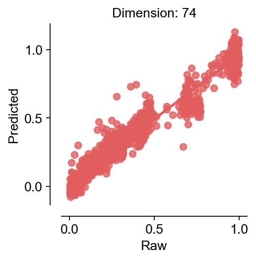
We can find that after filtering by an automatic threshold gate, only 76 genes are considered to be associated with pseudotime
cfg_obj.filter_coef.head()
| coef | abs(coef) | values | |
|---|---|---|---|
| ARHGAP42 | 0.009992 | 0.009992 | 0.329918 |
| GNAQ | -0.009275 | 0.009275 | 4.815562 |
| FCRL1 | 0.009218 | 0.009218 | 0.754004 |
| MSRB3 | -0.008434 | 0.008434 | 0.593459 |
| DANT2 | -0.008101 | 0.008101 | 0.316569 |
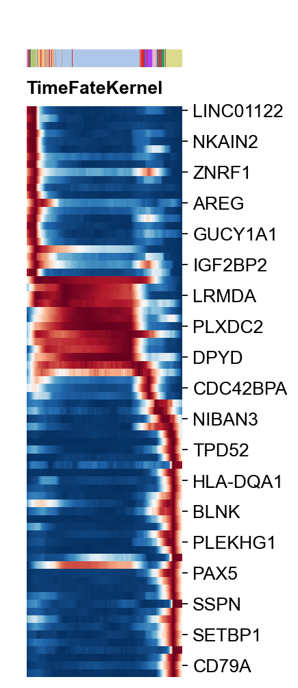
Time-Series Gene Heatmap Visualization
Here, we presented plot_heatmap to visualize the Time-Series Gene Heatmap Visualization
var_name=cfg_obj.filter_coef.index.tolist()
g=ov.utils.plot_heatmap(adata,var_names=var_name,
                  sortby='palantir_pseudotime',
                        col_color='celltype',
                 n_convolve=1000,figsize=(1,6),show=False,)

g.fig.set_size_inches(2, 8)
g.fig.suptitle('TimeFateKernel',x=0.25,y=0.83,
               horizontalalignment='left',
               fontsize=12,fontweight='bold')
g.ax_heatmap.set_yticklabels(g.ax_heatmap.get_yticklabels(),
                             fontsize=12)
plt.show()
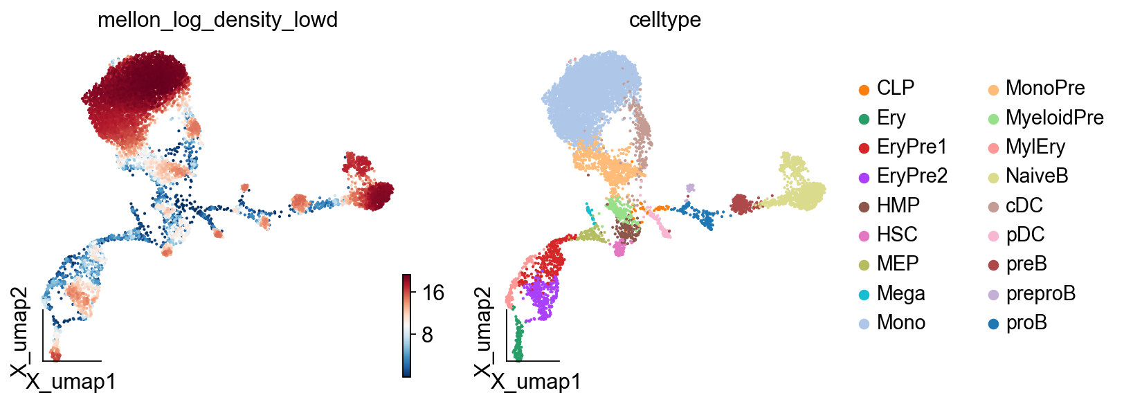
Density of Cells calculated
In this step, we will compute cell-state density using Mellon’s DensityEstimator class. Diffusion components computed above serve as inputs.
The compute densities, log_density can be visualized using UMAPs. We recommend the visualization of clipped log density. This procedure, which trims the very low density of outlier cells to the lower 5% percentile, provides richer visualization in 2D embeddings such as UMAPs.
cfg_obj.low_density(pca_key='X_pca')
computing neighbors
    finished: added to `.uns['neighbors']`
    `.obsp['distances']`, distances for each pair of neighbors
    `.obsp['connectivities']`, weighted adjacency matrix (0:00:22)
[2024-12-18 03:46:57,981] [INFO    ] Using sparse Gaussian Process since n_landmarks (5,000) < n_samples (8,627) and rank = 1.0.
[2024-12-18 03:46:57,983] [INFO    ] Computing nearest neighbor distances.
[2024-12-18 03:46:58,685] [INFO    ] Using d=1.7352303437057968.
[2024-12-18 03:46:58,801] [INFO    ] Using covariance function Matern52(ls=0.0010437683199839192).
[2024-12-18 03:46:58,802] [INFO    ] Computing 5,000 landmarks with k-means clustering.
[2024-12-18 03:47:11,537] [INFO    ] Using rank 5,000 covariance representation.
[2024-12-18 03:47:14,139] [INFO    ] Running inference using L-BFGS-B.
ov.pl.embedding(adata,
                basis='X_umap',
                color=['mellon_log_density_lowd','celltype'],
                frameon='small',
               cmap='RdBu_r')
Fate Gene of B lineages
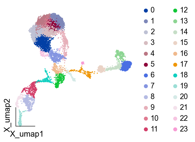
We selected PreB as the object of study and first used leiden clustering to obtain the differentiation categories of potential PreB
#ov.pp.neighbors(adata,use_rep='X_pca',
#               n_neighbors=15,n_pcs=30)
ov.pp.leiden(adata,resolution=2)
running Leiden clustering
    finished: found 24 clusters and added
    'leiden', the cluster labels (adata.obs, categorical) (0:00:00)
ov.pl.embedding(adata,
        basis="X_umap",
         color=['leiden'],title='',#size=15,
        show=False, #legend_loc=None, add_outline=False,
        frameon='small',
        legend_fontoutline=2,#ax=ax
                 )
<AxesSubplot: xlabel='X_umap1', ylabel='X_umap2'>
Local variability or local change in expression
Local variability provides a measure of gene expression change for each cell-state. This is determined by comparison of a gene in a cell to its neighbor cell-states and can be computed using palantir.utils.run_local_variability
cfg_obj.lineage_score(cluster_key='leiden',lineage=['20','17'],
                      expression_key='MAGIC_imputed_data')
#palantir,mellon
Run low_density first
Calculating lineage score
The lineage score stored in adata.var['change_scores_lineage']
scores = adata.var["change_scores_lineage"]
scores.sort_values(ascending=False)
EBF1          0.001614
DIAPH3        0.001494
MIR924HG      0.001401
AL589693.1    0.001341
ATP8B4        0.001338
                ...
AP001528.1    0.000000
AC110741.1    0.000000
KCNE1B        0.000000
CXCL1         0.000000
AC104809.2    0.000000
Name: change_scores_lineage, Length: 17226, dtype: float64
Fate Genes of B linages
We take the intersection of temporally related genes with locally variant genes to obtain the genes that drive PreB differentiation.
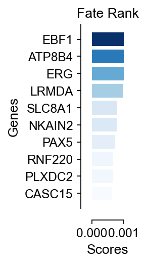
preb_genes=scores.loc[cfg_obj.filter_coef.index].sort_values(ascending=False)[:20]
preb_genes
EBF1      0.001614
ATP8B4    0.001338
ERG       0.001142
LRMDA     0.000985
SLC8A1    0.000791
NKAIN2    0.000781
PAX5      0.000736
RNF220    0.000677
PLXDC2    0.000672
CASC15    0.000640
SEL1L3    0.000539
SETBP1    0.000530
EZH2      0.000516
BLNK      0.000439
MSRB3     0.000429
NIBAN3    0.000416
NUSAP1    0.000415
FRY       0.000393
AFF3      0.000378
MEIS1     0.000369
Name: change_scores_lineage, dtype: float64
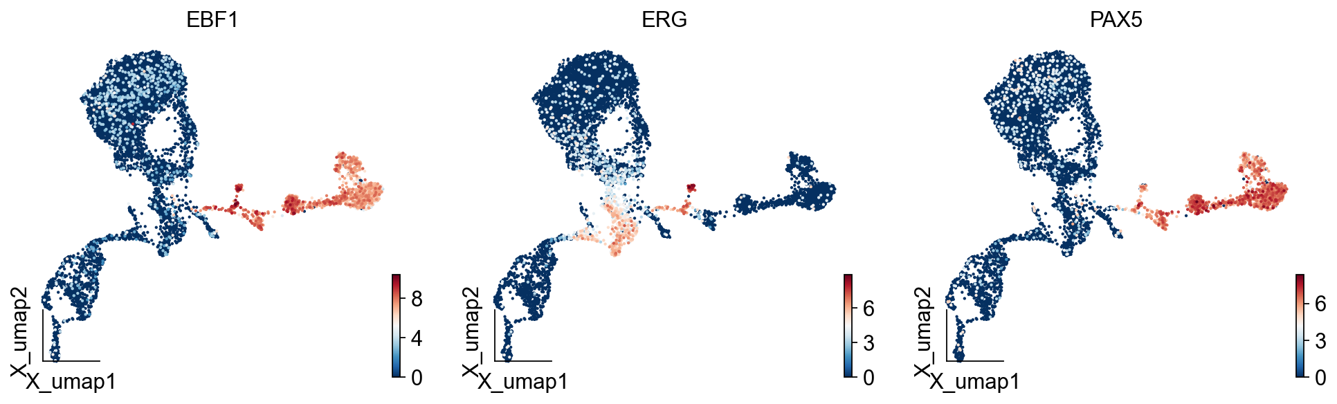
del adata.raw
import matplotlib.pyplot as plt
from matplotlib import patheffects
#fig, ax = plt.subplots(figsize=(3,3))

ov.pl.embedding(adata,
                basis='X_umap',
                color=['EBF1','ERG','PAX5'],
                frameon='small',
                size=15,
               cmap='RdBu_r',)
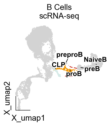
import matplotlib.pyplot as plt
from matplotlib import patheffects
fig, ax = plt.subplots(figsize=(3,3))

ad=adata
visual_cluster=['20','17']
ad.obs['visual']=ad.obs['leiden'].copy()
ad.obs.loc[~ad.obs['leiden'].isin(visual_cluster),'visual']=None
ov.utils.embedding(ad,
                basis='X_umap',frameon='small',
                color=['visual'],
                legend_loc=None,
                #palette=ov.utils.blue_color+ov.utils.orange_color+ov.utils.red_color+ov.utils.green_color,
                show=False,
                  ax=ax)

ov.pl.embedding_adjust(
    ad,
    basis="X_umap",
    groupby='celltype',
    exclude=tuple(set(ad.obs['celltype'].cat.categories)-set(['CLP','proB', 'preproB', 'preB', 'NaiveB'])),
    ax=ax,
    adjust_kwargs=dict(arrowprops=dict(arrowstyle='-', color='black')),
    text_kwargs=dict(fontsize=12 ,weight='bold',
                     path_effects=[patheffects.withStroke(linewidth=2, foreground='w')] ),
)

ov.pl.contour(ax=ax,adata=ad,
        basis="X_umap",
        groupby='leiden',clusters=visual_cluster,
        contour_threshold=0.02,colors=ov.pl.red_color[2],linestyles='dashed')

plt.title('B Cells\nscRNA-seq', fontsize=14)
#plt.savefig(f'figures/hsc/umap-lineage-B-33.png',dpi=300,bbox_inches='tight')
#plt.savefig(f'pdf/hsc/umap-lineage-B-33.pdf',dpi=300,bbox_inches='tight')
Text(0.5, 1.0, 'B Cells\nscRNA-seq')
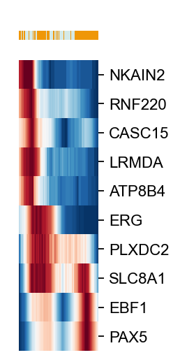
import matplotlib.pyplot as plt
g=ov.utils.plot_heatmap(ad[ad.obs['leiden'].isin(visual_cluster)],
                        var_names=scores.loc[cfg_obj.filter_coef.index].sort_values(ascending=False)[:10].index.tolist(),
                  sortby='palantir_pseudotime',col_color='leiden',yticklabels=True,
                 n_convolve=100,figsize=(1,6),show=False)

g.fig.set_size_inches(1, 4)
g.ax_heatmap.set_yticklabels(g.ax_heatmap.get_yticklabels(),fontsize=10)

#plt.savefig(f'figures/hsc/heatmap-lineage-B-leiden-24.png',dpi=300,bbox_inches='tight')
[Text(1, 0.5, 'NKAIN2'),
 Text(1, 1.5, 'RNF220'),
 Text(1, 2.5, 'CASC15'),
 Text(1, 3.5, 'LRMDA'),
 Text(1, 4.5, 'ATP8B4'),
 Text(1, 5.5, 'ERG'),
 Text(1, 6.5, 'PLXDC2'),
 Text(1, 7.5, 'SLC8A1'),
 Text(1, 8.5, 'EBF1'),
 Text(1, 9.5, 'PAX5')]
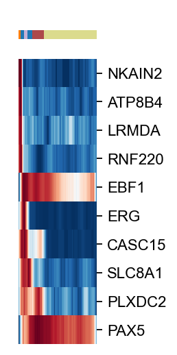
import matplotlib.pyplot as plt
g=ov.utils.plot_heatmap(ad[ad.obs['celltype'].isin(['CLP','proB','preproB','preB','NaiveB'])],
                        var_names=scores.loc[cfg_obj.filter_coef.index].sort_values(ascending=False)[:10].index.tolist(),
                  sortby='palantir_pseudotime',col_color='celltype',yticklabels=True,
                 n_convolve=100,figsize=(1,6),show=False)

g.fig.set_size_inches(1, 4)
g.ax_heatmap.set_yticklabels(g.ax_heatmap.get_yticklabels(),fontsize=10)

#plt.savefig(f'figures/hsc/heatmap-lineage-B-ct-24.png',dpi=300,bbox_inches='tight')
[Text(1, 0.5, 'NKAIN2'),
 Text(1, 1.5, 'ATP8B4'),
 Text(1, 2.5, 'LRMDA'),
 Text(1, 3.5, 'RNF220'),
 Text(1, 4.5, 'EBF1'),
 Text(1, 5.5, 'ERG'),
 Text(1, 6.5, 'CASC15'),
 Text(1, 7.5, 'SLC8A1'),
 Text(1, 8.5, 'PLXDC2'),
 Text(1, 9.5, 'PAX5')]
# 创建横向柱状图
import matplotlib.cm as cm
fig, ax = plt.subplots(figsize=(0.5, 3))

od_genes=scores.loc[cfg_obj.filter_coef.index].sort_values(ascending=False)[:10]

norm = plt.Normalize(min(od_genes.values), max(od_genes.values))
colors = cm.Blues(norm(od_genes.values))

plt.barh(od_genes.index, od_genes.values, color=colors)

ax.spines['left'].set_position(('outward', 10))
ax.spines['bottom'].set_position(('outward', 10))

ax.spines['top'].set_visible(False)
ax.spines['right'].set_visible(False)
ax.spines['bottom'].set_visible(True)
ax.spines['left'].set_visible(True)

ax.grid(False)

# 设置标签和标题
ax.set_xlabel('')
ax.set_ylabel('$R^2$', fontsize=13)
ax.set_title('', fontsize=13)
ax.set_xlim(0,0.001)
#ax.set_xticks(x + width)
ax.set_xticklabels(ax.get_xticklabels(),  fontsize=11,rotation=0)
ax.set_yticklabels(ax.get_yticklabels(), fontsize=11)

plt.xlabel('Scores',fontsize=12)
plt.ylabel('Genes',fontsize=12)
plt.title('Fate Rank',fontsize=12)
plt.gca().invert_yaxis()  # 反转y轴使得最高分数在顶部

#plt.savefig(f'figures/hsc/fr-lineage-B-33.png',dpi=300,bbox_inches='tight')
#plt.savefig(f'pdf/hsc/fr-lineage-B-33.pdf',dpi=300,bbox_inches='tight')
import seaborn as sns
fig, ax = plt.subplots(figsize=(3,3))
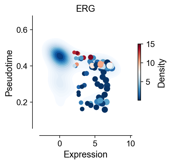
gene='ERG'
visual_cluster=['20','17']
x=ad[ad.obs['leiden'].isin(visual_cluster),gene].to_df().values.reshape(-1)
y=ad.obs.loc[ad.obs['leiden'].isin(visual_cluster),'palantir_pseudotime'].values.reshape(-1)
z=ad.obs.loc[ad.obs['leiden'].isin(visual_cluster),'mellon_log_density_lowd'].values.reshape(-1)
sns.kdeplot(
x=x, y=y,
fill=True,
cmap='Blues',
#clip=(-5, 5), cut=10,
thresh=0.1, levels=15,
ax=ax,#cbar=True,
)
scatter=ax.scatter(x,y,
c=z, s=x*10,
cmap='RdBu_r',
)
ax.spines['left'].set_position(('outward', 10))
ax.spines['bottom'].set_position(('outward', 10))
ax.spines['top'].set_visible(False)
ax.spines['right'].set_visible(False)
ax.spines['bottom'].set_visible(True)
ax.spines['left'].set_visible(True)
ax.grid(False)
plt.xlabel('Expression',fontsize=13)
plt.ylabel('Pseudotime',fontsize=13)
plt.xticks(fontsize=12)
plt.yticks(fontsize=12)
plt.title(gene,fontsize=13)
cbar = plt.colorbar(scatter, ax=ax,shrink=0.5)
cbar.set_label('Density', fontsize=13)
cbar.ax.tick_params(labelsize=12)
#plt.savefig(f'figures/hsc/density-lineage-B-{gene}.png',dpi=300,bbox_inches='tight')
#plt.savefig(f'pdf/hsc/density-lineage-B-{gene}.pdf',dpi=300,bbox_inches='tight')
#cbar.set_ticklabels(cbar.get_ticklabels(),fontsize=12)
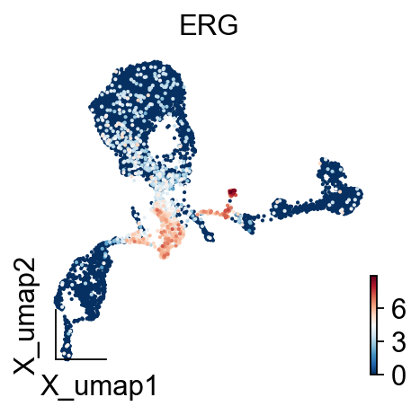
fig, ax = plt.subplots(figsize=(3,3))

#visual_cluster=['15','12']
#ad.obs['visual']=ad.obs['leiden'].copy()
#ad.obs.loc[~ad.obs['leiden'].isin(visual_cluster),'visual']=None
ov.utils.embedding(ad,
                basis='X_umap',frameon='small',
                color=[gene],
                legend_loc=None,
                #palette=ov.utils.blue_color+ov.utils.orange_color+ov.utils.red_color+ov.utils.green_color,
                show=False,
                ax=ax)
#plt.savefig(f'figures/hsc/umap-lineage-B-{gene}.png',dpi=300,bbox_inches='tight')
#plt.savefig(f'pdf/hsc/umap-lineage-B-{gene}.pdf',dpi=300,bbox_inches='tight')
<AxesSubplot: title={'center': 'ERG'}, xlabel='X_umap1', ylabel='X_umap2'>