Scientific plotting for publication with OmicVerse
In this tutorial, we focus on a practical question: how to make biologically accurate, visually consistent, and publication-ready figures when using omicverse.
This is not only an API tutorial. We will explain what to do, why to do it, and which mistakes to avoid when generating figures for manuscripts, preprints, and reports.
The core principles are:
figures should communicate biology before decoration
the same biological category should keep the same color across figures
panel size, font, resolution, and export format should be standardized early
continuous and categorical variables should use different color logic
final figures should be exported in both raster and vector formats whenever possible
import omicverse as ov
import scanpy as sc
import squidpy as sq
import seaborn as sns
import matplotlib.pyplot as plt
from matplotlib.colors import LinearSegmentedColormap

# Optional: use a processed AnnData object from your own analysis.
# adata = ...

# OmicVerse provides convenient styling helpers.
ov.plot_set(font_path='Arial')
🔬 Starting plot initialization...
Using already downloaded Arial font from: /tmp/omicverse_arial.ttf
Registered as: Arial
🧬 Detecting GPU devices…
✅ NVIDIA CUDA GPUs detected: 1
    • [CUDA 0] Tesla P100-PCIE-16GB
      Memory: 15.9 GB | Compute: 6.0
✅ plot_set complete.
1. Start from a reproducible visual standard
The first step in scientific plotting is not plotting. It is defining a reproducible visual baseline.
Why this matters:
If you tune font size and panel size manually for every figure, the entire manuscript becomes inconsistent.
If you save one figure at low resolution and another at high resolution, journal assembly becomes painful.
If you decide colors only at the end, you usually break consistency across embeddings, heatmaps, and spatial panels.
A good default for compact manuscript figures is:
single panel:
figsize=(4, 4)orfigsize=(3, 3)dense matrix or large embedding:
figsize=(8, 8)final export:
dpi=300crop white margins:
bbox_inches='tight'save both
pngandsvg
adata=ov.datasets.pbmc8k()
🩸 Downloading PBMC 8k dataset
Using Stanford mirror for pbmc8k
🔍 Downloading data to ./data/pbmc8k.h5ad...
✅ Download completed
 Loading data from ./data/pbmc8k.h5ad
✅ Successfully loaded: 7750 cells × 20939 genes
def set_publication_style(fontsize=12):
    plt.rcParams['figure.dpi'] = 80
    plt.rcParams['savefig.dpi'] = 300
    plt.rcParams['font.size'] = fontsize
    plt.rcParams['axes.labelsize'] = fontsize
    plt.rcParams['axes.titlesize'] = fontsize + 1
    plt.rcParams['xtick.labelsize'] = fontsize - 1
    plt.rcParams['ytick.labelsize'] = fontsize - 1
    plt.rcParams['legend.fontsize'] = fontsize - 1
    plt.rcParams['pdf.fonttype'] = 42
    plt.rcParams['ps.fonttype'] = 42


def save_figure_pair(stem):
    plt.savefig(f'{stem}.png', dpi=300, bbox_inches='tight')
    plt.savefig(f'{stem}.svg')
    #plt.savefig(f'{stem}.pdf')


set_publication_style(fontsize=13)
2. Separate categorical color design from continuous color design
A common mistake is to use the same color logic for all figures.
This is incorrect because:
categorical annotations such as cell types, clusters, niches, and samples require stable named colors
continuous values such as scores, abundance, logFC, or expression require ordered colormaps
Purpose of this step:
make the reader recognize the same biology instantly across multiple figures
prevent visual misinterpretation caused by arbitrary remapping
improve comparability between panels
Recommended rules:
for cell types or clusters: build a dictionary once and reuse it everywhere
for abundance-like values: start with
Redsfor signed effects such as enrichment or log fold change: start with
RdBu_r
# Example: stable categorical palette.
# Replace 'cell_type' with your own annotation column.

if 'cell_type' in getattr(adata, 'obs', {}):
    categories = list(adata.obs['cell_type'].astype('category').cat.categories)
    palette = ov.pl.sc_color[8:] + ov.pl.red_color + ov.pl.orange_color + ov.pl.sc_color
    color_dict = {k: palette[i] for i, k in enumerate(categories)}
else:
    color_dict = {
        'T cell': '#279AD7',
        'B cell': '#F0A202',
        'Myeloid': '#E45756',
        'Stromal': '#54A24B',
    }

# Example: continuous colormap choices.
seq_cmap = 'Reds'      # abundance, score, density, expression intensity
signed_cmap = 'RdBu_r' # up/down, positive/negative, centered contrasts
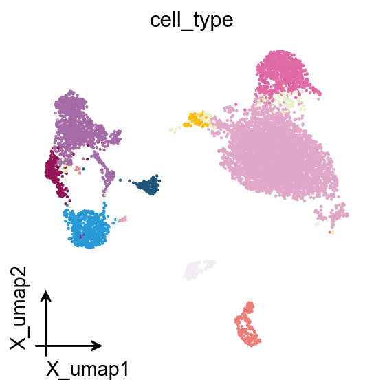
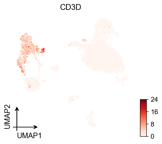
3. Make embeddings readable before making them beautiful
UMAP, MDE, t-SNE, and spatial embeddings are often the first figures people see. Their purpose is usually overview and orientation, not decoration.
What this step should achieve:
show the major biological structure clearly
preserve category identity with stable colors
remove unnecessary visual clutter
Good practice:
use a compact square panel
keep point size moderate
remove oversized legends inside dense panels
avoid changing palette order across figures
use the same
basisand annotation names consistently throughout the tutorial or manuscript
adata
AnnData object with n_obs × n_vars = 7750 × 20939
    obs: 'kit', 'tissue_ontology_term_id', 'tissue_type', 'assay_ontology_term_id', 'disease_ontology_term_id', 'cell_type_ontology_term_id', 'self_reported_ethnicity_ontology_term_id', 'development_stage_ontology_term_id', 'sex_ontology_term_id', 'donor_id', 'suspension_type', 'predicted_celltype', 'is_primary_data', 'cell_type', 'assay', 'disease', 'sex', 'tissue', 'self_reported_ethnicity', 'development_stage', 'observation_joinid'
    var: 'gene_name', 'feature_name', 'feature_reference', 'feature_biotype', 'feature_length', 'feature_type'
    obsm: 'UMAP', 'X_pca', 'X_umap'
# Categorical embedding
fig, ax = plt.subplots(figsize=(4, 4))
ov.pl.embedding(
    adata,
    basis='X_umap',
    color='cell_type',
    #palette=color_dict,
    frameon='small',
    legend_loc=None,
    show=False,
    ax=ax,
)
save_figure_pair('figures/plotting/embedding_celltype')
plt.show()

# Continuous embedding
fig, ax = plt.subplots(figsize=(4, 4))
ov.pl.umap(
    adata,
    color='CD3D',
    cmap='Reds',
    frameon='small',
    show=False,
    ax=ax,
)
save_figure_pair('figures/plotting/embedding_module_score')
plt.show()
X_umap converted to UMAP to visualize and saved to adata.obsm['UMAP']
if you want to use X_umap, please set convert=False
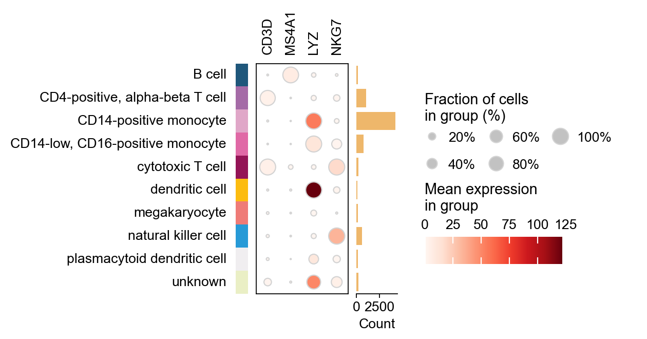
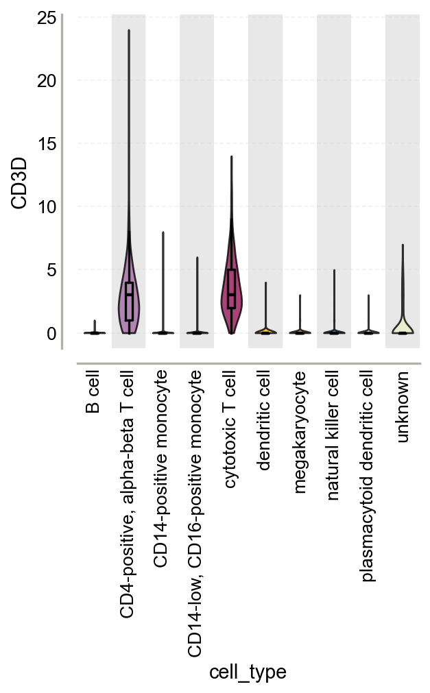
4. Use dotplots and violins to answer specific biological questions
Embeddings are useful for overview, but they are weak for exact comparison. When you need to compare marker intensity, signature activity, or group differences, use summary plots.
Why this step matters:
dotplots compress many genes and groups into a readable panel
violin plots expose distribution shape instead of only mean signal
these plots provide stronger support for biological interpretation than embeddings alone
The goal is not to show more genes. The goal is to show the right genes with a clear group order.
marker_genes = ['CD3D', 'MS4A1', 'LYZ', 'NKG7']

ov.pl.dotplot(
    adata,
    marker_genes,
    groupby='cell_type',
    cmap='Reds',
    figsize=(4, 4),
    show=False,
)
save_figure_pair('figures/plotting/dotplot_markers')
plt.show()

fig, ax = plt.subplots(figsize=(4, 4))
ov.pl.violin(
    adata,
    keys=['CD3D'],
    groupby='cell_type',
    rotation=90,
    stripplot=False,
    show=False,
    ax=ax,
    add_box=True
)
save_figure_pair('figures/plotting/violin_module_score')
plt.show()
5. Heatmaps should emphasize structure, not complexity
Heatmaps are powerful because they reveal coordinated patterns across groups. They are also easy to overcomplicate.
Purpose of this step:
summarize structured differences across cell states, niches, or pathways
make trends visible at a glance
keep group-level interpretation readable
Recommended practice:
cluster only when clustering adds information
use diverging colormaps for centered values and sequential colormaps for abundance
keep labels readable before increasing matrix size
# Example matrix: rows are categories, columns are features/pathways.
# Replace with your own summary matrix.
# matrix = ...

# sns.clustermap(
#     matrix,
#     cmap='RdBu_r',
#     figsize=(8, 8),
#     center=0,
# )
# plt.savefig('figures/plotting/heatmap_signed.png', dpi=300, bbox_inches='tight')
# plt.savefig('figures/plotting/heatmap_signed.svg', dpi=300, bbox_inches='tight')
6. Spatial plots should preserve tissue context while remaining interpretable
When plotting spatial transcriptomics or CosMx-style segmentation results, you should treat the image background as context, not as the main message.
Why this step matters:
too much segmentation detail hides biology
too much biological overlay hides tissue structure
readers should be able to see both location and pattern without visual overload
Practical rules:
keep panel shape close to square when possible
use compact layouts such as
(4, 4)for a single field of viewkeep contour lines and overlays visually subordinate
reuse the same category colors used in embeddings and summary plots
# Example for segmented spatial plotting.
# Adjust keys to your own AnnData object.

sq.pl.spatial_segment(
    adata,
    color='cell_type',
    library_key='fov',
    library_id='1',
    seg_cell_id='cell_ID',
    palette=color_dict,
    img=False,
    figsize=(4, 4),
    dpi=300,
    legend_loc=None,
    frameon='small',
    show=False,
)
save_figure_pair('figures/plotting/spatial_segment_celltype')
plt.show()
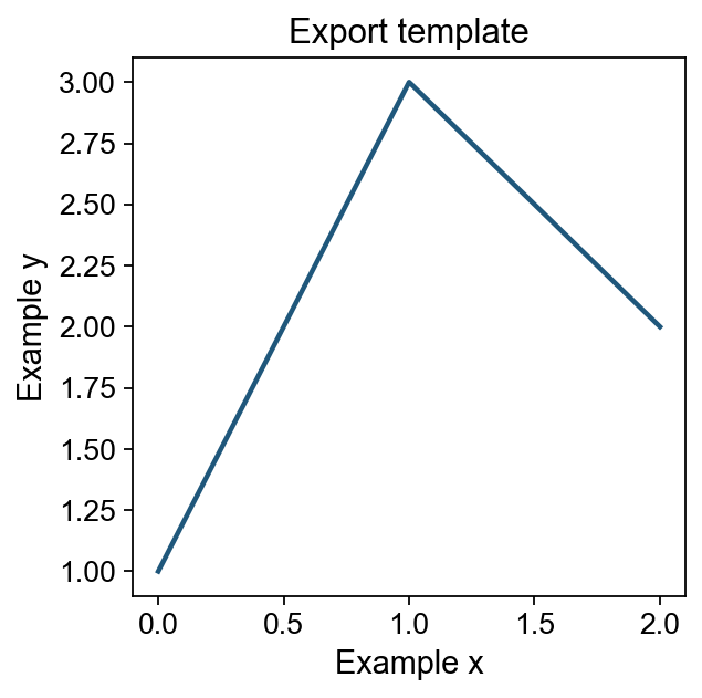
7. Export for both analysis and publication
Export is not a cosmetic afterthought. It determines whether your figure survives manuscript preparation.
Why save both formats:
pngis convenient for quick inspection, slides, and raster-based submissionssvgis better for vector editing, journal layout, and text sharpness
Why dpi=300 matters:
below this, labels and small symbols often degrade in print or PDF assembly
Why bbox_inches='tight' matters:
unnecessary margins complicate multi-panel composition
fig, ax = plt.subplots(figsize=(4, 4))
ax.plot([0, 1, 2], [1, 3, 2], lw=2)
ax.set_xlabel('Example x')
ax.set_ylabel('Example y')
ax.set_title('Export template')
save_figure_pair('figures/plotting/export_template')
plt.show()
8. A practical checklist before you finalize a figure
Before a figure enters a manuscript, verify the following:
Biological meaning is clear: the plot answers one question well.
Category colors are stable: the same cell type is not recolored in another panel.
Colormap logic is correct: sequential for abundance, diverging for signed contrasts.
Text is readable: labels are not oversized, but they also do not disappear after export.
Panel geometry is consistent: similar figures use similar figure sizes.
Legends are under control: present when needed, suppressed when redundant.
Export is complete: both
pngandsvgare saved withdpi=300.The figure can stand alone: title, axis labels, and color interpretation are understandable without code.
If a figure fails any of these checks, improve the figure before generating more figures.
Summary
A good scientific figure in omicverse is not defined by complexity. It is defined by consistency, semantic color usage, appropriate plot choice, and clean export.
A useful working order is:
define global style
fix categorical palettes
choose the correct continuous colormap
make the overview plot
make the evidence plot
export in paired formats
Once you standardize these steps, your plotting workflow becomes faster, more reproducible, and much easier to maintain across a full project.